Monday, December 24, 2012

Making Time For Holiday Cheer.


We’ve had a great year this year, but not when it comes to keeping up with the blog. Busy times and increased workload have taken precedence over expressing ourselves online.

The completed wreath.


We normally prepare an involved holiday greeting for this space, but there wasn’t time this year. We didn’t want to let the year pass without some sort of holiday greeting, so I thought we would (finally) post some photos of our wreath we designed for this year’s Jingle and Mingle event on December 6th, which benefits Children of Shelters.

Our raspberry boucle and grey herringbone fabrics.


We were inspired by suiting textiles for both women and men and used a raspberry colored boucle accented with a grey herringbone. The upholstery of the wreath was executed by Richard Andronaco.
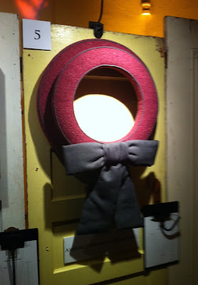
The wreath as it appeared at the event.


We wish you and your families a Merry Christmas full of health, happiness and prosperity.

Warmest Wishes for an amazing 2013,

Barbara & David

Sunday, October 14, 2012

Entrate! Italian Portal Inspiration: Part I


Inspiration can come from anywhere. In Italy, finding inspiration is clearly stacked in your favor! On my trip there this Spring I became obsessed doors and door hardware. The rich and aged embellishments offer visual exhilaration in spades. Here is the first part of what I saw that inspired me…

Carved door detail Parma:


Stone archway on display at the Sforza Castle in Milan:
Aged paint in Parma:
Door knocker with hand with laurel / lion motif in Parma:
A former Villa becomes a home for the Prefecture (Police) station in Parma:
Art Noveau lion motif in Parma:
Salvatore Ferragamo building in Florence:
Church door detail Florence:


More Italian portal inspiration to come!

David J. Hansen

Top photo: Porto Buenes Aires Milan

All photos by David J. Hansen for Ashfield Hansen Design 

* All photographs are copyright 2012 Ashfield Hansen Design and may not be used without express permission

Monday, July 23, 2012

More From Milan 2012: Sophisticated Wares- Nature Included!


Although it’s been a considerable amount of time since Salone del Mobile concluded in Milan, I’m anxious to share some of the wondrous sights I saw there.


Every year the event has a different feature emphasis, and this year it was “Euro Cucina” so Kitchens and appliances figured prominently in what I saw. One of the trends I noticed with many exhibit spaces was an overt display of plant life and nature…it was everywhere and the scale of these features were impressive.

Huge plant walls, ancient olive trees and even a wall of tomatoes made up these references to nature. Here are some of my favorites:


An enormous Olive tree at Liebherr


A “green wall” at Stosa


Another “green wall” at Rimadesio


Yards of blooming Jasmine at Smeg (featuring a denim clad refrigerator)….


The most impressive by far was the booth for Minacciolo, which featured enormous walls created with crates of real tomatoes…


More dispatches from Italy (and the Design world) to come…
Ciao!
David J. Hansen

Tuesday, May 22, 2012

First Impressions: Milan 2012

Although it's been a few days since first arriving in Milan for iSaloni and Design Week, I'm still reeling from my first trip to the design capitol of Italy!

Feeling a bit overwhelmed, I'm trying to process everything I've seen since my arrival. Milan seems to conspire to take the past and collide it into the future to create the present. Of course the city is beautiful and bustling, but there seems to be more to this city than the sum of it's parts.

This is a little of what I saw around Milan during our first couple of days...


David J. Hansen

All photographs by David J. Hansen for Ashfield Hansen Design Inc. / Copyright 2012

Sunday, April 15, 2012

Italy Awaits!


I'm headed to Italy this week...One of my favorite places on the planet! It's been many years since I was last there, so I'm looking forward to some new adventures.


I'll be starting out in Milan by attending the Salone Internazionale del Mobile, which is one of the largest contemporary furniture exhibitions in the world. I will be sending updates from the road, so stay tuned.

After Milan I'll be doing some sightseeing, visiting with family and lots of eating!

Please check our Facebook page for the latest updates from the road!

Buon Viaggo!

David J. Hansen

Monday, April 2, 2012

Farewell Mr. Hadley


On Friday the world learned that iconic Interior Designer Albert Hadley passed away at the age of 91. His name is as synonymous with the industry as “chair” or “window covering”, and his iconic status as America’s preeminent decorator is no accident. He was one of my Interior Design idols, and his presence and example will be sorely missed. When I decided to become an Interior Designer, I could not think of a better person to try to emulate than Mr. Hadley.


By all accounts, Mr. Hadley’s career, was not so much envied and coveted, but admired and aspired to. He did more for the Design industry as an ambassador than could ever be imagined. 


I learned much about him when I bought the Rizzoli book about his life that is in his own words, with commentary by Adam LewisHis career is nearly mythic in who it cross-references along his journey. When moving to New York he sought out mentors in design legends like Rose Cumming, Billy Baldwin, Van Day Truex and of course he is best known for his collaboration with Sister Parish at their eponymous firm Parish Hadley.


Although I never met Mr. Hadley, I have admired him and his work since before I became a designer. In the Rizzoli book he is quoted as saying:

“ Decorating is not about making stage sets, it’s not about making pretty pictures for magazines; it’s really about creating a quality of life, a beauty that nourishes the soul. Design is coming to grips with one’s real lifestyle, one’s real place in the world. Rooms should not be put together for show, but to nourish one’s well being.”

Thank you Mr. Hadley for showing us how it’s done.

David J. Hansen

*All photos are from House Beautiful and were photographed by Fernando Bengoechea.

Sunday, March 4, 2012

Tulip Tulip How I Love Thee On A Tree


This time of year makes me happy.  Just about everywhere I am seeing my favorite Saucer Magnolias with their grand sweeping bows laden with those gorgeous purple and white blooms.  
The buds make me think of Nina Campbell’s tertiary color palette particularly her combination of celery greens and pale purples.  Lovely.


Barbara Ashfield

Tuesday, February 14, 2012

The Look Of Love


In our vocation we use furniture, fabrics, accessories and lighting to express a mood or feeling. In honor of St. Valentine’s Day, we wondered what it might look like to express the feeling of love using these tools. Here are a few examples of what the “Interior of Love” might contain…
  

A Fornasetti tray...
A contemporary "Tete-a-tete"...
A Chinoissiere bed frame from Anthropologie...
A fabric from Donghia...
A red Parsons table...
A silver Champagne bucket...

A red coral chandelier...
Happy St. Valentine’s Day!

David Hansen 

Friday, February 3, 2012

Inscribed With Light


Ever since my post on Holiday Illumination (which can be found here), I’ve been obsessed with light and how it photographs. Imagine my joy when I learned about collaboration between two European artists that involves just that.


Tabarly-Nantes 2011


Julien Breton (aka Kaalam) is a French artist who is inspired by Calligraphy. He melds Arabic and Old English styles in light using long exposures to create focal points that are seemingly familiar. He collaborates with photographer David Gallard (aka Mr. Guep). Together they create landscapes that they have dubbed as “abstract Calligraphy” using unique light accents, which are unlike anything I’ve seen before.

Under The City-Nantes 2011


Intimite-Dampsmesil 2011


The Movement Abbaretz 2011


All hail the marriage of photography and light!
David Hansen

Top photo:
Aerial-Dampsmesil 2011
All photographs taken from Julien Breton’s artist site here.
Visit Kaalam’s Flickr page here.