
Have a wonderful Earth Day and Easter weekend!
Barbara Ashfield & David Hansen
Antique map image via imagespark.com
Have a wonderful Earth Day and Easter weekend!
Barbara Ashfield & David Hansen
Antique map image via imagespark.com

With that being said, I must admit to having a favorite and that was SAN SEBASTIAN! I’m not sure if it was the people, the hotel, the weather, or the days spent riding my bike along the ocean Promenade that made it so amazing, but it was just that. And what could be better than ending the day at sunset watching the surfers whilst sippingon the perfect mojito! Truly postcard perfect.
Here is a sampling of San Sebastian through my eyes…


Barbara Ashfield
All photos by Barbara Ashfield for Ashfield Hansen Design Inc.

The event showcases local floral designers and garden clubs interpretations of the museum’s most cherished works using flowers.
Bouquets to Art is organized and produced by the volunteer members of the Fine Arts Museums of San Francisco Auxiliary, and is the largest fundraiser the museums hold for the entire year. The money raised helps fund special acquisitions and educational programs.
Here are some of the photos we snapped while touring the exhibit…
After Diebenkorn...

A Classical interpretation...

After Mark Rothko...

By City College of San Francisco...

Inspired by the upcoming Balenciaga exhibit...

A nude inspiration...

David Hansen
*All photos by Barbara Ashfield and David Hansen for Ashfield Hansen Design inc.

Not many people can boast a portrait of themselves by David LaChapelle. and the use of the color Red seems to be a common thread (which isn’t as easy)…divine!

The design for Ms. Guinness’ residence was implemented by architect Daniel Romualdez. The spread was photographed by Thomas Loof.
The article can be viewed can view here.
David Hansen

Style. A common enough word, but what does it really mean? The dictionary has many definitions, but is most commonly described as “A particular, distinctive, or characteristic mode of action or manner of acting: They do these things in a grand style”. Certainly style is subjective, but most people can recognize style, and may think of it as something “special” that lacks description.

We would like to thank and pay tribute to our friend and local blogger extraordinaire Kendra Boutell. Anyone who hasn’t experienced her lovely blog “Porcelains & Peacocks” should visit there post-haste! Her posts manage to educate, while dazzling her readers with unique imagery and subjects. A few weeks back Kendra nominated us for a Stylish Blogger award, to which we thank her!
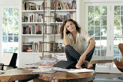
We thought we would take this opportunity to share some of what we hold as sacred and stylish. Here are our two takes on style and inspiration (hence the name Design Squared)…
Barbara:
I think Jackie Kennedy said it best with “Style is not a function of how rich you are, or even who you are…style is a habit of mind that puts quality before quantity, noble struggle before mere achievement, honor before opulence. It’s what you are. It’s your essential self. It’s what makes you ..you.” And I wholeheartedly agree.

As for inspiration, I think I’m most inspired by people who live life on their own terms. I take inspiration fromforeign travels, ensconcing myself in the local culture as much as possible, taking in design, cuisine, art and architecture and watching the locals go about their daily lives. I am inspired at the Farmers Market by beautiful fresh produce and flowers, especially the colors and the smells. And last but not least, rummaging through old issues of House & Garden and Gourmet, neverknowing when something will hit me for a current project.
My style Icons are:
1) Madeleine Castaing for following her own drummer and without knowing it created her own “Castaing Style” that is timeless.

2) The Dutchess of Devonshire for her elegance and her chickens!

3) Diane Von Furstenberg for her enduring style, sophistication, success, and dedication to family.

David:
My sense of what I consider stylish stems primarily from the fantasies of an only child who was captivated by a range of imagery from old Hollywood to exotic far away places. It’s difficult to put style into words, but it’s something you know is right, but defies definition. Three people I would choose to epitomize style would be:

1) Gene Kelly – A masculine archetype who was debonair and always dressed with a timeless dash.

2) Nina Simone – She was someone who had an ultimate command of her craft, amazing verve, but couldn’t be defined by categories.

3) Daphne Guinness – Heir to the Guinness fortune, she is the ultimate fashioinista, who truly loves fashion and the people who create it.

Today we pass the torch as we award our choices for Stylish Blogger Award to:
Claudia Juestel of Adeeni Design Blog
Denny Holland of Denny Holland Studio and
Diane Dorrans Saeks of The Style Saloniste.
Barbara Ashfield & David Hansen
Photos from top:
1) The Duchess of Devonshire from wwd.com
2) Daphne Guinness from LaModellaMafia.com
3) Diane Von Furstenberg from shelterpop.com
4) The Duchess of Devonshire as a young woman.
5) Madeleine Castaing from emilyevanseerdmans.blogspot.com
6) The Duchess of Devonshire with her chickens.
7) Diane Von Furstenberg by photographer Frazer Harrison.
8) Gene Kelly from allstarpics.com
9) Gene Kelly from genekellygallery.com
10) Nina Simone from fatberris.com
11) Nina Simone from cnettv.com
12) Daphne Guinness from L’Uomo Vogue February 2010.


Photos from top:
1) Artwork by Diane Scaccalosi in Avalon Mission Bay III lobby.
Interior Design: Tom Eliot Fisch, Building Architect: Arquitectonica, Photography: Tom Seawell.
2) Lobby at Avalon Bay. Artwork by various artists. Interior Design: Tom Eliot Fisch. Photography: David Wakley.


This visual language usually consisted of tones of blue, aqua and indigo while incorporating natural textures like linen and burlap. The textiles used were usually of an exotic nature like paisley, ikat or batik. The merchandising theme to accompany this departure was usually called “Fresh Starts”, or some related variation. This was meant to quite literally represent the visual equivalent to the “Anti-Christmas”. Depending on what retail establishment you worked for you might or might not be promoting Valentines Day which might or might not mean using more red as a display device so a firm demarcation was required to erase the former holiday away.

I’ve been thinking about this idea since ringing in 2011 and trying to apply it to an interior design context. What would “Fresh Starts”, or the “Anti-Christmas” look like in an interior? I’m thinking light, airy spaces that feel like a vacation. Some good examples might be some of the legendary Michael Taylor’s later work, a Moroccan Riad, or perhaps the work of Benjamin Noriega-Ortiz. The possibilities are endless.


What are your “Fresh Starts”? Whatever this means for you, just breathe and let the holidays become a memory!
David Hansen
Photographs from top:
1) Bergdorf Goodman window display May 23, 2008 photographed by Rudy Panzano for anothernormal.com
2) The Mondrian Hotel with interior by Benjamin Noriega-Ortiz.
3) Dixneuf La Ksour Riad from Hoosta magazine.
4) Michael Taylor interior photographed by Russell MacMasters from Architectural Digest.
5) Nacho Polo interior photographed by Andrea Satini from yatzer.com.



 Posts
All Comments
Posts
All Comments


