Sunday, April 17, 2011

VIVA ESPAÑA – SAN SEBASTIAN!


Just back in town after a wonderful 10 days in northern Spain where I visited Madrid, Bilbao, San Sebastian and Barcelona – the perfect itinerary.

With that being said, I must admit to having a favorite and that was SAN SEBASTIAN! I’m not sure if it was the people, the hotel, the weather, or the days spent riding my bike along the ocean Promenade that made it so amazing, but it was just that. And what could be better than ending the day at sunset watching the surfers whilst sippingon the perfect mojito! Truly postcard perfect.

Here is a sampling of San Sebastian through my eyes…


Barbara Ashfield

All photos by Barbara Ashfield for Ashfield Hansen Design Inc.

Wednesday, March 23, 2011

Flower Power!


Barbara and I recently attended Bouquets to Art at San Francisco’s DeYoung Museum. The event, which was the 27th annual lasted for five days (March 15-19) and was formerly held at the Legion of Honor.

The event showcases local floral designers and garden clubs interpretations of the museum’s most cherished works using flowers.

Bouquets to Art is organized and produced by the volunteer members of the Fine Arts Museums of San Francisco Auxiliary, and is the largest fundraiser the museums hold for the entire year. The money raised helps fund special acquisitions and educational programs.

Here are some of the photos we snapped while touring the exhibit…

After Diebenkorn...

A Classical interpretation...

After Mark Rothko...

By City College of San Francisco...

Inspired by the upcoming Balenciaga exhibit...

A nude inspiration...

David Hansen

*All photos by Barbara Ashfield and David Hansen for Ashfield Hansen Design inc.

Sunday, March 13, 2011

Speaking Of Daphne...


After choosing Daphne Guinness as one of my style icons in our last post, imagine my delight when the new issue of Architectural Digest arrived (the next day) with photos of her chic apartment on 5th Avenue in New York City.

Not many people can boast a portrait of themselves by David LaChapelle. and the use of the color Red seems to be a common thread (which isn’t as easy)…divine!

The design for Ms. Guinness’ residence was implemented by architect Daniel Romualdez. The spread was photographed by Thomas Loof.

The article can be viewed can view here.

David Hansen

Saturday, March 5, 2011

Stylish Aspirations


Style. A common enough word, but what does it really mean? The dictionary has many definitions, but is most commonly described as A particular, distinctive, or characteristic mode of action or manner of acting: They do these things in a grand style. Certainly style is subjective, but most people can recognize style, and may think of it as something “special” that lacks description.

We would like to thank and pay tribute to our friend and local blogger extraordinaire Kendra Boutell. Anyone who hasn’t experienced her lovely blog “Porcelains & Peacocks” should visit there post-haste! Her posts manage to educate, while dazzling her readers with unique imagery and subjects. A few weeks back Kendra nominated us for a Stylish Blogger award, to which we thank her!
We thought we would take this opportunity to share some of what we hold as sacred and stylish. Here are our two takes on style and inspiration (hence the name Design Squared)…

Barbara:

I think Jackie Kennedy said it best with “Style is not a function of how rich you are, or even who you are…style is a habit of mind that puts quality before quantity, noble struggle before mere achievement, honor before opulence. It’s what you are. It’s your essential self. It’s what makes you ..you.” And I wholeheartedly agree.

As for inspiration, I think I’m most inspired by people who live life on their own terms. I take inspiration fromforeign travels, ensconcing myself in the local culture as much as possible, taking in design, cuisine, art and architecture and watching the locals go about their daily lives. I am inspired at the Farmers Market by beautiful fresh produce and flowers, especially the colors and the smells. And last but not least, rummaging through old issues of House & Garden and Gourmet, neverknowing when something will hit me for a current project.

My style Icons are:

1) Madeleine Castaing for following her own drummer and without knowing it created her own “Castaing Style” that is timeless.

2) The Dutchess of Devonshire for her elegance and her chickens!

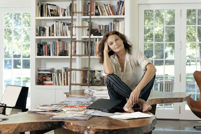
3) Diane Von Furstenberg for her enduring style, sophistication, success, and dedication to family.


David:

My sense of what I consider stylish stems primarily from the fantasies of an only child who was captivated by a range of imagery from old Hollywood to exotic far away places. It’s difficult to put style into words, but it’s something you know is right, but defies definition. Three people I would choose to epitomize style would be:

1) Gene Kelly – A masculine archetype who was debonair and always dressed with a timeless dash.

2) Nina Simone – She was someone who had an ultimate command of her craft, amazing verve, but couldn’t be defined by categories.

3) Daphne Guinness – Heir to the Guinness fortune, she is the ultimate fashioinista, who truly loves fashion and the people who create it.

Today we pass the torch as we award our choices for Stylish Blogger Award to:

Claudia Juestel of Adeeni Design Blog

Denny Holland of Denny Holland Studio and

Diane Dorrans Saeks of The Style Saloniste.


Barbara Ashfield & David Hansen

Photos from top:

1) The Duchess of Devonshire from wwd.com

2) Daphne Guinness from LaModellaMafia.com

3) Diane Von Furstenberg from shelterpop.com

4) The Duchess of Devonshire as a young woman.

5) Madeleine Castaing from emilyevanseerdmans.blogspot.com

6) The Duchess of Devonshire with her chickens.

7) Diane Von Furstenberg by photographer Frazer Harrison.

8) Gene Kelly from allstarpics.com

9) Gene Kelly from genekellygallery.com

10) Nina Simone from fatberris.com

11) Nina Simone from cnettv.com

12) Daphne Guinness from L’Uomo Vogue February 2010.

Sunday, February 13, 2011

IN THE "PINK"


Color makes a splash in our lives, be it subtle or smashing. Always has, always will.

With February now in full view my mind’s eye seems clouded in images of pinks. I have a lifetime of memories associated with pink, something like walking through the days of my life wearing rose colored glasses. Let me share my “pink” with you…
Pink was the color of my ballet slippers in Annabel’s dance class, and pink was peppermint ice cream from Edy’s.
Pink was the color of my bedroom growing up and the shade of my first lipstick when I turned 16.
Pink is the color of my favorite champagne, and flamingos in the Camargue.
Pink is the color of winter skies at dusk and new babies wrapped in white blankets.
Pink is the color of the roses on my birthday.


Pink is my favorite sandstone and the color of tourmalines from Brazil.
Pink is the filling of raspberry macaroons from Laduree and the color of my favorite lemonade.
What color is your month?
Barbara Ashfield

Photos from top:
A) Cherry Blossoms from flickr.com
B) Vogue cover 1957 autumn fuschias
C) Pink butterflies from flickr.com
D) Serendipity Chocolates tasting “Salon” by Ashfield Hansen Design Inc.
E) Guest room at the Cotswalds.
F) Grapefruit Anise Sorbet from Gourmet magazine.
G) Pink Sunset photo from zingerbug.com
H) Pink Rose.
I) Farrow & Ball Lancaster Pink in Northhamptonshire Photo by Ivan Terestchenko.
J) Macaroons from Laduree from victoriawithlove.bogspot.com.

Monday, February 7, 2011

A New Resource From an Old Friend!


Creativity Explored, our wonderful local art program has become like an old friend. My involvement with them has escalated to a position on their Board of Directors, of which I am honored to serve.For those of you who don't know about Creativity Explored, they are a local organization where people with developmental disabilities make, display and sell their art. I was even moved to write a blog post about them back in 2009 here.

In the past few years they have joined forces with the likes of Recchiuti Confections and the retailer CB2 (the off-shoot of Crate & Barrel) to use some of the artists works as powerful images on rugs, pillows and chocolates. This is all done through a licensing program, which has become an essential component of CE's art sales.

Another program which has gained momentum over time is CE's Art Services Program. This program allows clients to commission, rent, exhibit or consult about art from CE artists. This program, although available to anyone has been geared toward design professionals. There has been a significant interest in CE art by designers of commercial interiors, in fact our Board President Amy Eliot of Tom Eliot Fisch discovered CE through working on a project for her firm. My mission has been to bring the message of Creativity Explored's Art Services program to professionals working primarily on residential interiors. To that end, we have organized a reception for designers and architects on February 9th (this coming Wednesday) from 5:00pm to 8:00pm. If your in San Francisco, please come and experience this program first hand. More information can be found here.

David Hansen

Photos from top:

1) Artwork by Diane Scaccalosi in Avalon Mission Bay III lobby. 
Interior Design: Tom Eliot Fisch, Building Architect: Arquitectonica, Photography: Tom Seawell.

2) Lobby at Avalon Bay. Artwork by various artists. Interior Design: Tom Eliot Fisch. Photography: David Wakley.


Saturday, January 22, 2011

Fresh Starts!


Before I decided to pursue interior design, my former career was in retail window display and visual merchandising. Every January my former vocation seems to come to mind. After all the work of decorating a large retail store for Christmas it was almost painful to think of eradicating any signs of it from the premises. To abandon all the red, sparkle and luxe the look of Christmas defines; the New Year was usually met with a different visual approach.

This visual language usually consisted of tones of blue, aqua and indigo while incorporating natural textures like linen and burlap. The textiles used were usually of an exotic nature like paisley, ikat or batik. The merchandising theme to accompany this departure was usually called “Fresh Starts”, or some related variation. This was meant to quite literally represent the visual equivalent to the “Anti-Christmas”. Depending on what retail establishment you worked for you might or might not be promoting Valentines Day which might or might not mean using more red as a display device so a firm demarcation was required to erase the former holiday away.

I’ve been thinking about this idea since ringing in 2011 and trying to apply it to an interior design context. What would “Fresh Starts”, or the “Anti-Christmas” look like in an interior? I’m thinking light, airy spaces that feel like a vacation. Some good examples might be some of the legendary Michael Taylor’s later work, a Moroccan Riad, or perhaps the work of Benjamin Noriega-Ortiz. The possibilities are endless.

What are your “Fresh Starts”? Whatever this means for you, just breathe and let the holidays become a memory!

David Hansen

Photographs from top:

1) Bergdorf Goodman window display May 23, 2008 photographed by Rudy Panzano for anothernormal.com

2) The Mondrian Hotel with interior by Benjamin Noriega-Ortiz.

3) Dixneuf La Ksour Riad from Hoosta magazine.

4) Michael Taylor interior photographed by Russell MacMasters from Architectural Digest.

5) Nacho Polo interior photographed by Andrea Satini from yatzer.com.

Sunday, January 2, 2011

AN APPLE A DAY…


New Year’s Day…. A day filled with the promise of good will and good fortune in the coming year. For me it’s opening the last gift of the holiday season. I always seem to be full of joy on this day, as if all I have to do is wish for what I hope for in the coming year and it will magically happen.

For the last 10 years, give or take a year or two, I’ve chosen to spend New Years Day with my dad at the beach. Typically we venture out in the early afternoon and head over the hill to glorious Half Moon Bay. For the last 2 years we’ve lunched at Sam’s Chowder House where, when the weather permits, we sit outside in big Adirondack chairs around a cracking fire and get lost in a couple of hours of conversation or sometimes just silence while taking in the beautiful view before us. The ocean has such an ethereal and calming effect.

The crowning moment of New Year’s Day is when I toss an apple into the ocean on which I’ve written my wishes for the new year. I got this idea from a friend years ago and it’s stayed with me ever since. For what it’s worth, I’ve been both lucky AND fortunate, as many of my dreams and wishes have come true.

I wish you a year filled with promise and good fortune.

Barbara Ashfield

Photos:

Top photo of my Dad on the beach

Second photo of the harbor at Princeton By The Sea

All photos by Barbara Ashfield for Ashfield Hansen Design Inc.