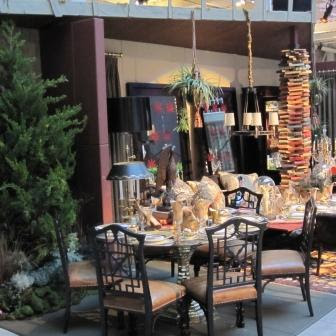
It’s hard to believe a year has gone by since the last Dining By Design. It’s an event that I really enjoy, both as a participant and as a guest.

Patrice Cowan Bevan's table in the McRae showroom.
Given that we most probably would post on this event, David and I made the decision beforehand that we would each look for trends among tables. David, being more of a modernist, and I, more of the traditionalist, surveyed the environs and came up with our own conclusions. My mood was more somber this year and I decided to focus on the overall ambience. Right off the bat, I thought this year’s event was quieter than in the past, perhaps because we as a society have become quieter; more humble, more thoughtful, more grateful for what we have. This is not to say that it was less in pizzazz than years past; truth be told I thought it was a tad more elegant.

The table done by designer GIl Mendez with Murray's Ironworks and Anthem.
There were 30 tables rather than 50, and with that, I felt that I had more emotional space to take in and appreciate each designer’s vision and message. There were enough tables to captivate me but not so many as to suffocate and overwhelm my senses. There was more room to mingle, the hors d’oeuvres were more plentiful, and the crowd more mellow. I actually had enough personal space to engage in conversation with friends and colleagues who had designed tables I admired. Given that, my rave reviews go to Gil Mendez, Patrice Cowan-Bevans, Joel Robare and The Art & Antiques Exchange. Each designer’s table was entirely different, ranging in scope with themes heralded from India to Santa Fe, from merry old England to Indochine.
A simply elegant Asian themed table by Antiques and Art Exchange.
An environment evoking Armistead Maupin's "Tales of The City" designed by Joel Robare with Hartle Media.
In essence, I had a wonderful evening, fully engaged in the design, among friends and colleagues, all of us absorbed in the creativity that we share.
Colorful plastic buckets used as lighting in the national table by Kravet.
David’s take:
Our work for Dining by Design this year had been done mostly behind the scenes. We worked closely with the steering committee on producing gift bags worthy of praise and a silent auction which, for the first time would last two nights rather than one. Not having much exposure to the creative side of DBD, when the event was finally upon us, we were able to see all the creativity, drama and exuberance for the first time.
Detail of the table done by Patrice Cowan Bevans in the McRae showroom.
Obviously, the economy has not been as favorable as in years past, resulting in a few less tables; however this did not seem to diminish the quality of the table environments in the least, which I think were stronger than ever. I do think economic factors may have consciously or unconsciously affected many of the table’s themes. This is not a bad thing. I am happy to think that the design industry, and we as a society might be moving back toward a more gracious and formal time where design is not disposable and instantaneous. Having said this, I think two trends which were evident at this year’s event were Restraint and Optimism.
A subdued table done by Jute.
Table detail done by Karmen Ng of Cantilever Design with flowers in PVC pipe.
I noted that at many of the tables there was a return to a simple elegance, rather than relying on “over the top” devices. I read this as restraint, which speaking as a designer isn’t always easy when you are designing for an event like Dining by Design. Many tables traditionally are designed to say ”LOOK AT ME!” These tables exhibited muted rather than vibrant tones and incorporated traditional details which will always be beautiful and chic. Sometimes you don’t need to be knocked over you just want something really beautiful to look at. This is especially apropos considering they are ultimately dining environments.

A study in Fuschia designed by Robert Fung for Hartmann Studios.
Many tables had an amazing and vibrant use of color, which I read as optimism. It’s hard to feel down when you’re looking at a beautiful tableau full of color. I noticed that tones of Fuchsia and Hot Pink were particularly in evidence. I felt these colorful bastions were saying “it’s all going to be all right!”
Gensler's installation which used words to express Dining by Design's cause.
Some optimism came through in the form of empowering words, as in the table by Gensler which celebrated the cause Dining by Design was created for.
David Hansen


No comments:
Post a Comment